

Google seems to have updated their interface with a fresh look in the mobile search results. This fresh look gives a chance for the brand or site to be able to make the link or web address more attractive and customized.
The older look had a standard blue colored text with the site or brand in the green text which would comparatively be smaller and less evident. The change of look gives more emphasis to the publisher as the brand logo is highlighted towards the left and on top of the standard blue text. Even though this fresh look is very light and makes a very small change in the overall look of the search results, it is surely going to satisfy a lot of publishers and brands especially because of the small logo or personal icon option. This especially adds a unique pictorial identity to the site and highlights it very subtly.
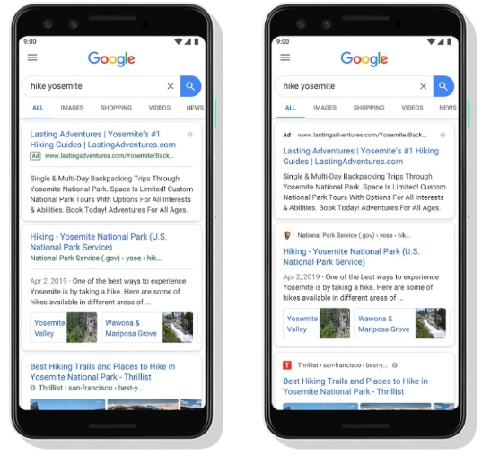
This would also make it easier for the users especially when they have some previous preferences with publishers, this icon representation would make it easier for them to directly click on the link of their preferred publisher by scrolling. Moreover also making it simpler for them to identify between publisher’s websites and ads that come in the search results.
The advertisement links are now also shown more prominently with a bold black “Ad” on a white background in place of the icon. This is surely going to be a plus point for Google and moreover for the publishers. This all new and improved look for the Google search results has been made official by Google themselves and is all set to be up and running in a few days.
ConnieTog
With thanks. Loads of knowledge! http://fumankong11.cc/home.php?mod=space&uid=739704