


Facebook has recently received a lot of backlash due to so many reasons. And if their week wasn’t bad enough, there was another one to add to the company’s list of miseries. Recently, the company was accused of stealing another company’s logo. Facebook has started financial services recently and people were not too happy with this decision. The company is named Calibra and it has launched its logo recently. And the logo resembles the logo of a startup bank named Current.
Current is also into financial services but for a totally different reason. It was launched in 2017 and it is designed for kids. The children can control their debit card with the help of an app. Just last year they have also introduced a regular checking account. The company noticed the uncanny resemblance in the logos and taunted Calibra on Twitter. They used the picture of both the logos in their tweet and compared them by saying, “This is what happens when you only have one crayon left”.
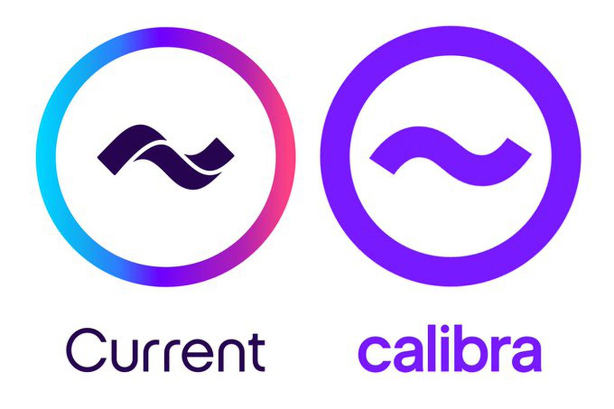
Photo Credit: The Verge
The logos of both companies consist of a tilde mark within a circle, but the difference arises when it comes to color. The circle of Current’s logo consists of multiple colors and the tilde mark is also segmented. While on the other hand, Calibra’s logo consists of a simple purple color. It is entirely possible that this resemblance in the logo can be an accident because the cryptocurrency of Facebook named Libra has also used the same kind of tilde marks in their logo as well.
Leave a Reply